We are all constantly surrounded by brand symbols and images. Every day, wherever you go - even if you stay at home - you are bombarded with logos and graphics. We are familiar with many of them to the point where we only need to see a tiny part of it or a colour, and we instantly recognise which brand it belongs to.
But how well do you know the story behind them? Here, we look at twenty of the most iconic brand symbols and what they mean - you may pick up some handy information for the office pub quiz!
IBM
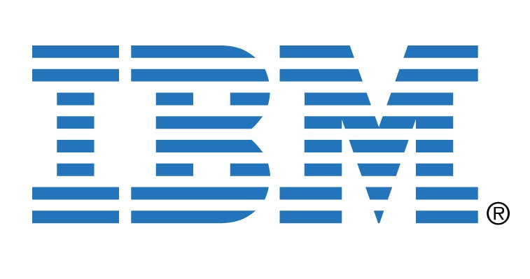
The IBM (International Business Machines) logo that we all recognise today was designed in 1972 by Paul Rand. It features a capital bold typeface to demonstrate authority and power, whilst the negative stripes running through it signify speed and dynamics. It is blue - which is a common colour for corporate logos as it denotes professionalism and strength.
Apple
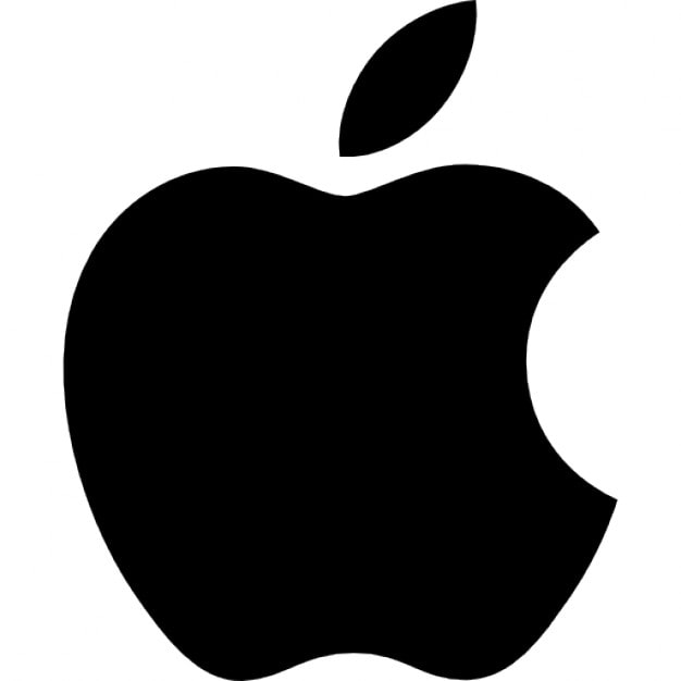
Probably one of the most recognisable logos on the planet; the iconic apple with a chunk taken out was designed by Rob Janoff in 1977. Originally, the apple was rainbow-coloured to represent coloured graphics that the computers could generate, but in 1999, the coloured stripes were dropped in favour of the current plain black logo.
McDonald’s
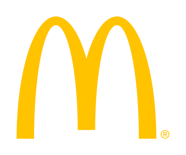
There are few logos more recognisable than the golden arches of McDonald’s. The ‘Ich Liebe Es’ campaign launched in Munich on September 2nd 2003, which was soon translated and introduced to English-speaking countries as the iconic ‘I’m Lovin’ It’ slogan, which has featured in adverts ever since.
Pepsi
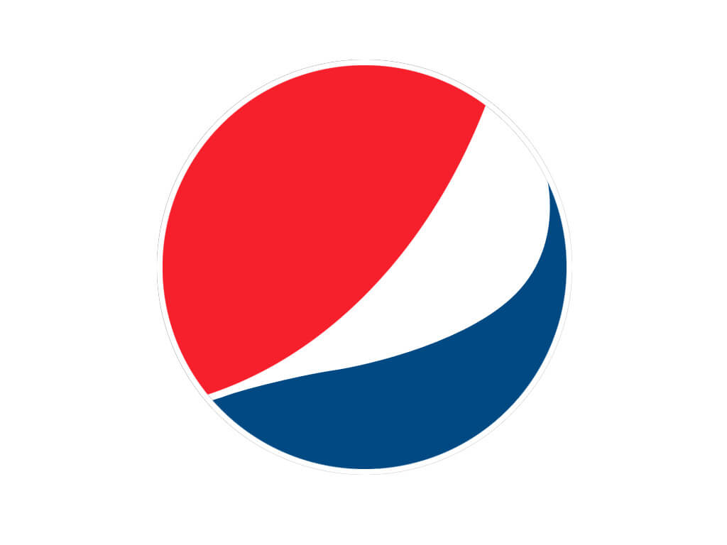
The globe we see and recognise today as the Pepsi logo first came about just after the US joined the second world war in the 1940s. To show their support, Pepsi launched a new cap for their bottles that showed the Pepsi typography with blue and red swirls on a plain white background. With the brand already being very much a part of everyday life, the design was less of a marketing ploy and more of a display of solidarity and patriotism. 2008 and 2009 saw a rebranding of the logo by the brand.
Did you know, however, that Pepsi was not always called Pepsi? To begin with, it was named ‘Brad’s Drink’, named after the inventor of the carbonated drink, Caleb Bradham. The name didn’t last long before being changed to Pepsi, and interestingly, that name was not trademarked for another five years after that.
Visa
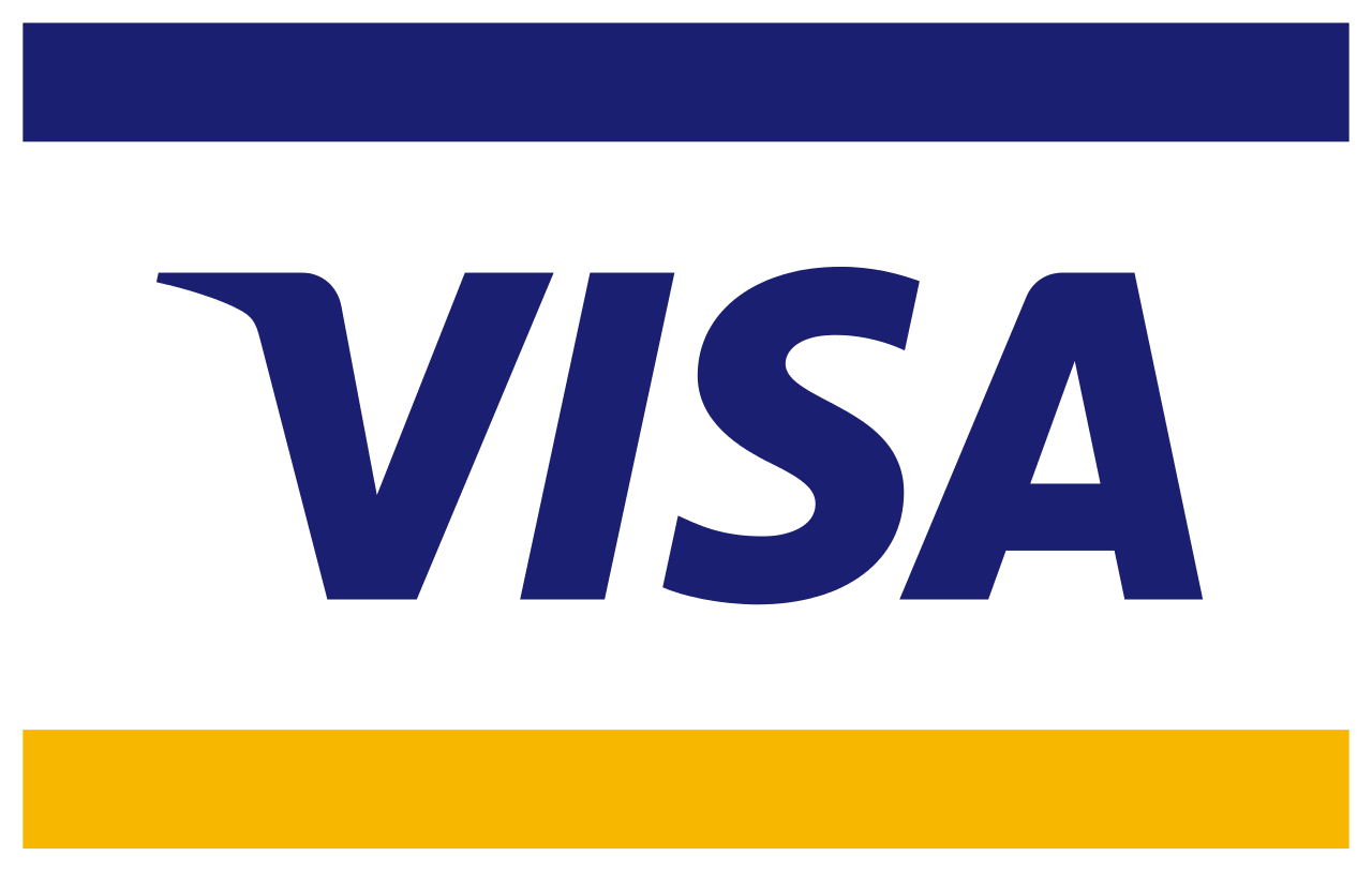
The instantly recognisable colours of the Visa logo - gold and deep blue - were chosen as representations of the golden hills of California and the colour of the sky in California. This is the founding place of the Bank of America. The logo was changed in 2005; the horizontal stripes were removed and replaced with a much simpler design. The background was white, ‘Visa’ was in dark blue with a bright orange ‘flick’ on the V. In 2015, Visa decided to put the blue and gold stripes back on the Electron and Debit cards, although they did not use it in their main branding.
Coca-Cola
John S. Pemberton finalised the recipe for his drink in 1886. His bookkeeper, Frank M. Robinson suggested Coca-Cola for the name of the product, stating that the two 'C's in the name would look great in the adverts.
The font has not changed much since then. It has had a few minor tweaks here and there, but the overriding sense of consistency throughout the generations has cemented Coca-Cola's image of tradition and stability.
Nike
Nike was originally established as Blue Ribbon Sports in 1964, before changing to Nike in 1978. The famous Nike ‘tick’ is known as the swoosh - conveying speed and movement, a blur of motion. It is incredibly simple, which has made it a brand logo that almost everyone recognises straight away. It has undergone a few changes throughout the years, mostly in terms of the colour of the tick, but the basic shape has remained.
Disney
The Disney logo has changed multiple times over the years, but even just one of the letters is enough for people to identify it. In 1985 the iconic Disney castle was introduced. The castle featured in various redesigned forms up until the simple, single-word logo we recognise now was launched in 2006. The font, which is universally loved, is based on the handwriting of Walt Disney, the founder of the brand.
Microsoft
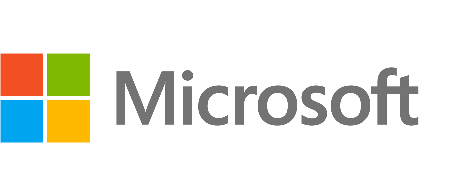
Microsoft was launched by Bill Gates and Paul Allen in 1975. There have been multiple logo changes over the years, showing that the company is one that is prepared to be flexible and move with the times. The first logo that the computer company used was generated by the two founders using a programming language. It used rounded, concentric fonts, which was very much in keeping with the disco era that was the 1970s. The logo that exists today came about in 2012. Colour was added to the logo for the first time, and each window represents an element of the Microsoft umbrella.
Starbucks
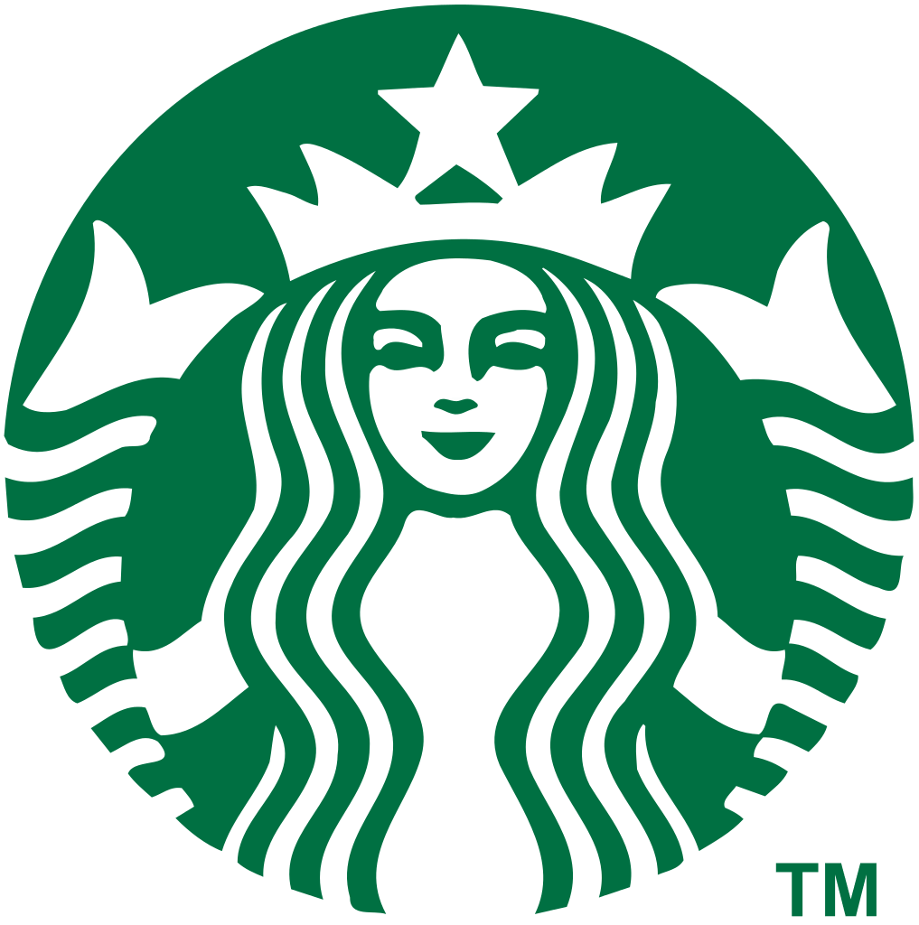
The symbol of the mermaid with two tails or Greek siren was what was found on the side of coffee cups everywhere, as a way of luring in coffee fans from everywhere. It is sexy and alluring - a mermaid staring into the eyes of the consumer, with her hand draped seductively over her body. The logo has gone through changes since its conception in 1971. The biggest change came about in 1987 when Harold Schultz acquired the company. He polished it up to be the sharp, professional logo we know and love today.
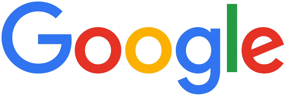
Google is another instantly recognisable - and colourful - logo. The current logo launched in 2015 but regularly changes depending on current events, special days, famous people’s birthdays and so on. Many of these occasional logos, otherwise known as Google Doodles, have been the brainchild of Dennis Hwang.
Adidas
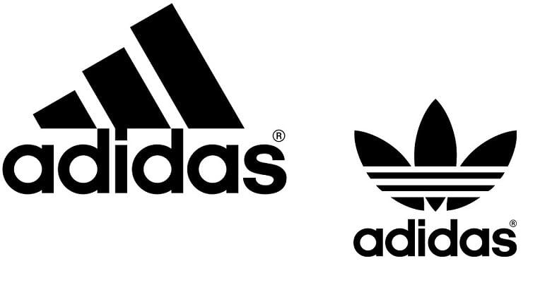
The logo that has been used by sporting giant Adidas since 2005 harks back to the simple concept of the three stripes design. It represents leadership and quality while maintaining the ability to adapt and transform in the future. It is iconic, cool and embodies everything that a top of the range sports brand should be. It is little wonder that Adidas transcended the sporting world and made its way firmly into the everyday world.
Volkswagen
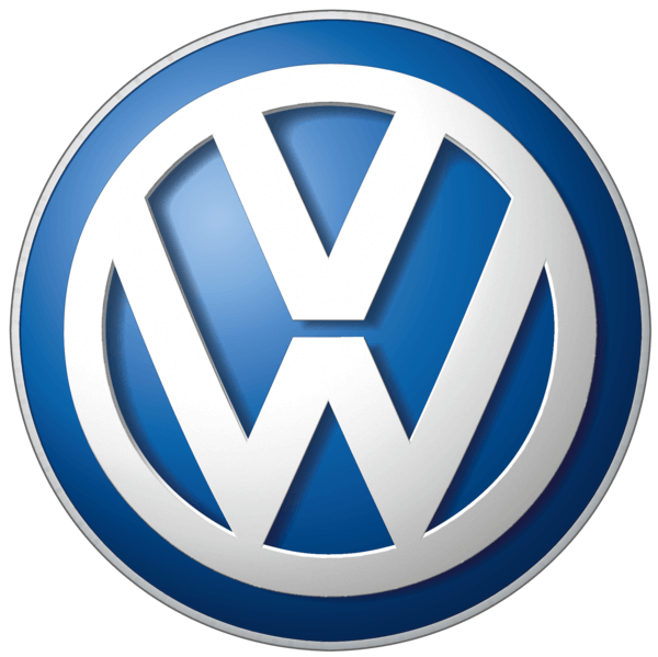
When we think of Volkswagen, we immediately think of the blue, silver, and white colour scheme. This logo came about at the turn of the millennium. When it was first launched, however, the logo was purely black, but in the 1960s the car manufacturer transitioned to the more approachable and down to earth blue colour scheme. The logo features the initials of the company, VW, which stands for Volks and Wagen. This literally means ‘car of the people’.
Amazon

Amazon's logo is simple and to the point and has remained unchanged since the launch of the brand in June 2000. It features an arrow that is curved, going from the A to the Z. This represents the fact that the online retailer can deliver almost any product from A to Z. The arrow is in the shape of a smile, to highlight the friendliness and down to earthiness of the company.
Toblerone
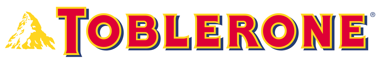
The Toblerone logo is an interesting one, with more to it than first appears. Toblerone has some deeper imagery entwined in their logo. Look closely; it looks like a bear climbing up the mountainside. This is because it is said that the triangle shape of the Matterhorn high mountain-inspired Theodor Tobler to create his chocolate in its unique triangular prism shape. Matterhorn is nicknamed ‘the city of bears’, hence the inclusion of the hidden bear in the logo.
Cadbury
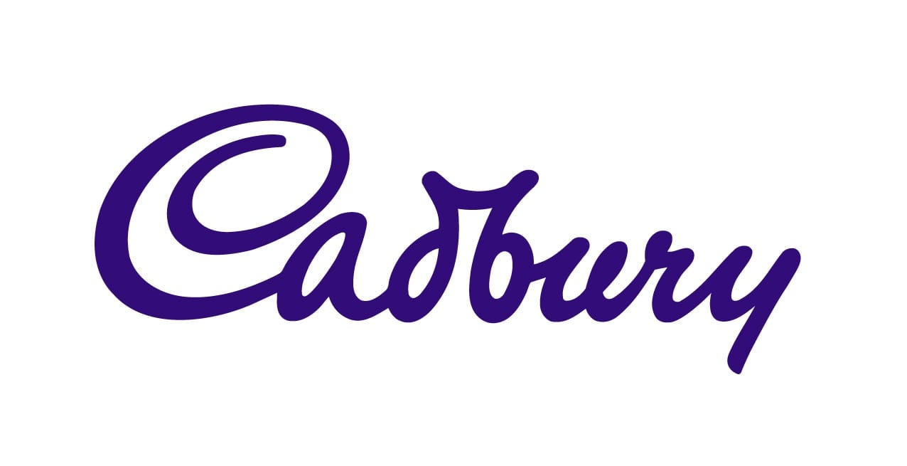
The original Cadbury logo was commissioned by William Cadbury in 1906. It was an abstract cocoa tree entwined with the business name. It was featured on all the marketing and promotional materials, including being printed onto the foil that the chocolate bars were wrapped in. The original logo is not used any more, it was used between 1911 and 1939, and then again after the end of World War Two.
The scripted logo, which is based on William Cadbury’s signature, first appeared on the fleet of transport in 1921. It has been cleaned up and polished since then and came into popular use in 1952.
Lego
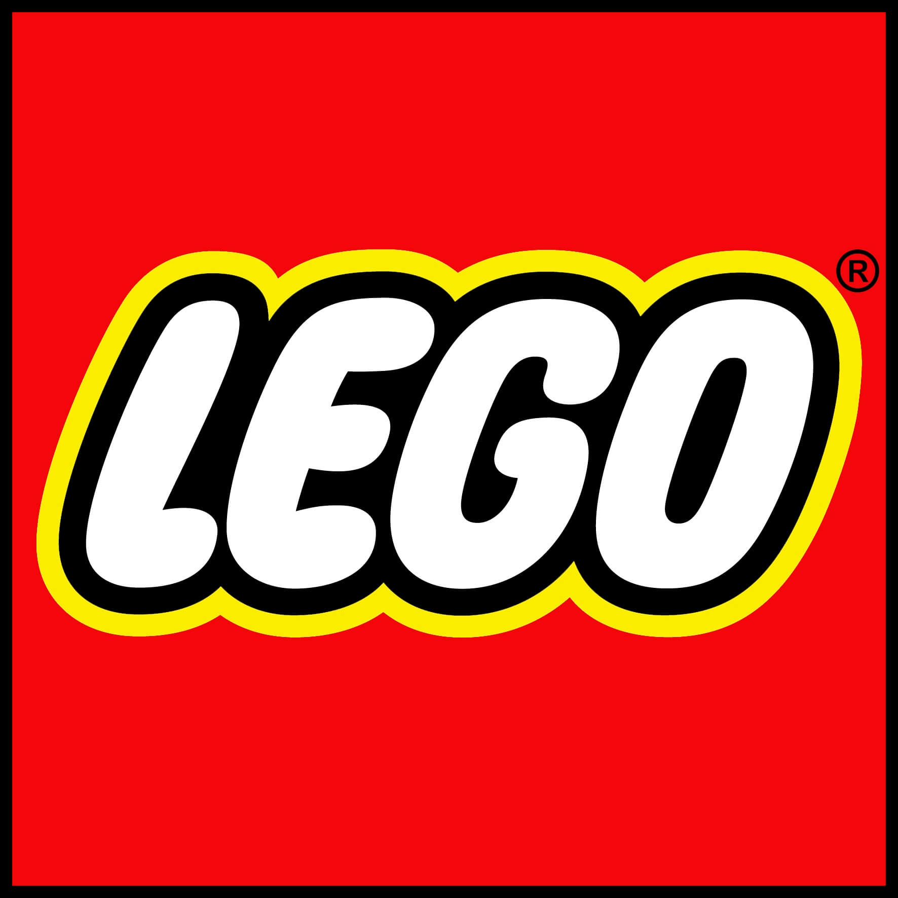
Lego, the iconic toys for children, have a long and rich past. The bricks were once made of wood and were made by Ole Kirk Christiansen in his workshop in 1932. Two years later, the company was given the name Lego, which comes from 'Leg Godt' - the Danish phrase meaning play well. What makes Lego's logo really stand out is its bright simplicity - the red, white, and yellow stand out to consumers and grab the attention of young children - their target demographic.
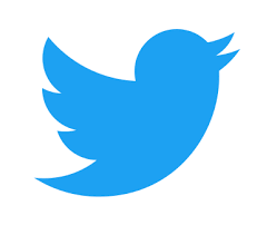
When it comes to simple, clean logos, Twitter has it nailed, and this works in the social media giant’s favour. The original logo for the company was even more simple - a white plain background with the name in blue writing. What Twitter hoped to do was to portray how simple and easy it is to use the platform: 250 characters (or 140 at its point of conception) to convey thoughts, opinions, ask questions and communicate with other users. This became known as 'Tweeting', and so the famous Twitter bird was introduced in 2010. This was a great move, as it completely embodied what the action and the company are all about. In 2012, the Twitter wording was dropped from the logo so that they could focus on the single bird.
Nestle
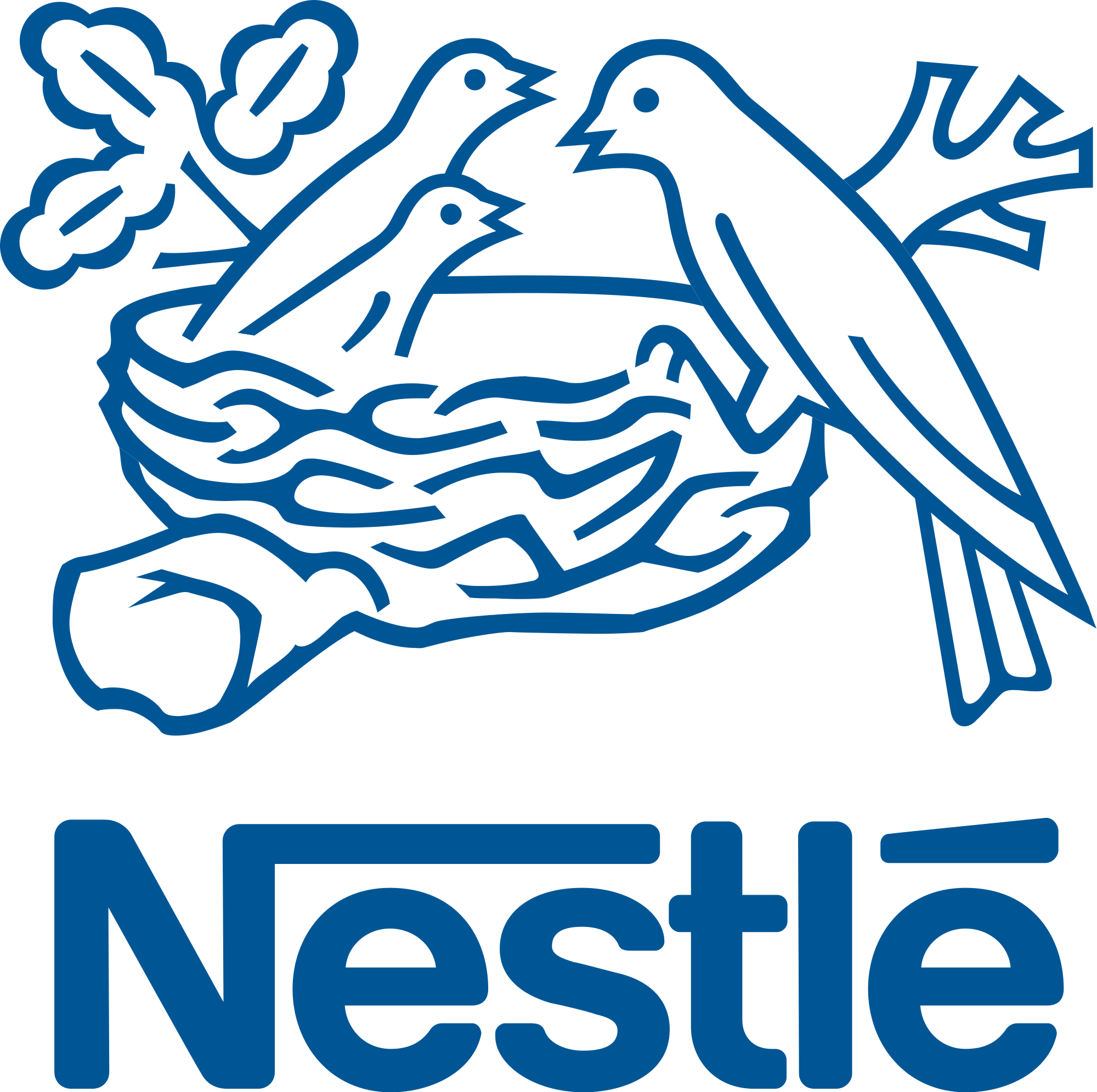
The very first Nestle logo - a solo bird perched on a nest - referenced the Nestle coat of arms, based on their family name, which translates to 'nest' in English. Henri Nestle, who founded the company, adapted this with the addition of three baby birds being fed. This was done to create the link between the Nestle name and their initial product, which was baby cereal. In 1868, the image began to be used as a trademark and even now, it is still used on the many products manufactured by Nestle, albeit in an adapted form.
Dell
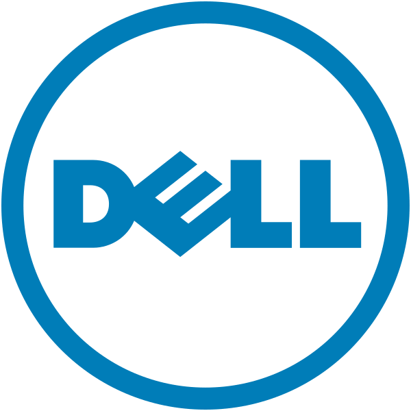
Last, but not least: Dell. Siegal + Gale, the hugely successful worldwide branding and marketing agency came up with the original logo for Dell in 1984. The iconic 'E', which is slanted, was symbolic of founder Michael Dell's ambition to “turn the world on its ear”. Over time, it became more and more popular and before too long became one of the most iconic and well-recognised logos in the field of computers and technology. In the latter part of 2010, the logo was revamped a little.
Lippincott was the branding firm tasked with designing the new logo for the computer company. The typeface was designed exclusively for the brand. It is called Museo and was created in collaboration with Jos Buivenga, a Dutch designer. There was a bit of tweaking with the letters and the angle of the ‘E’, and the wording was circled with a blue ring, protecting the Dell wording, and giving it the appearance of a globe. This represents the worldwide reach of the company.