Over the years, we’ve helped thousands of organisations find office space to rent across London and the UK. One thing that we always remind clients is the influence that a colour scheme can have on employee productivity.
In this article, we show you the best colours to boost productivity, which colours to avoid, and how to assess colour schemes when viewing serviced offices.
Colours That Increase Productivity in an Office
Blue
Blue is ideal for task-heavy environments in industries such as tech, finance and administration, as it is known for promoting focus.
Green
Green is often linked with balance and calm, as it’s gentle on the eyes and works well in highly stressful environments. We often receive feedback from our clients saying that they opted for a green colour scheme because it felt cosier and more comfortable.
Yellow
Yellow is widely recognised for boosting optimism and creativity. It is commonly used in creative industries where brainstorming sessions are key.

Soft Neutrals
Colours like beige, light grey, and muted whites provide a clean and neutral background without being boring. These tones can be easily mixed with brighter colours and work well for most industries.
Saturation is key when using any of the above colours. Too much of any colour (even those associated with boosting productivity) can quickly backfire if used excessively. A balance of bright and muted tones supports productivity better than one dominating colour.
Colours to Use with Caution
Red
Red is known to stimulate energy and urgency, which can be beneficial in corridors or breakout spaces but may be overwhelming in offices or meeting rooms.
Black and Dark Grey
In moderation, dark colours can add sophistication to most office spaces, but if overused, they can create a heavy and sombre mood.
We usually advise our clients against choosing offices which are decorated with dark tones unless there is plenty of natural light or they are balanced with lighter accents.

Overly Bright Colours
Neon colours and overly saturated tones can be harsh on the eyes and very distracting. Again, it is important to balance these tones with more neutral tones.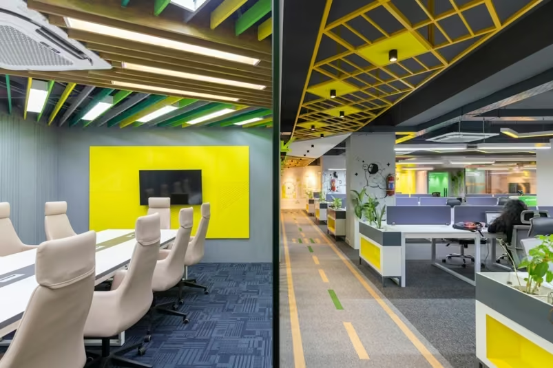
How Colours Affect Mood and Focus
We’ve already covered the best colours for productivity (blue, green and yellow), but what about other colours which can be found in offices, and how do they affect mood and focus?
Orange
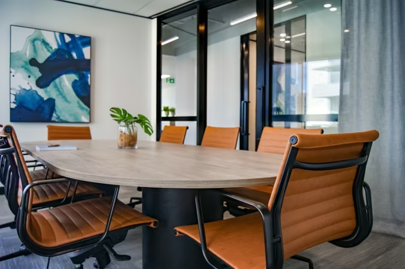
The perfect blend of red’s energy and yellow’s optimism, orange is ideal for creative spaces like lounges or meeting rooms, as it enhances creativity.
Grey
Ranging from light to dark, grey is perfect for adding balance to a workspace. Light greys are calming, whilst darker tones add a sense of style. It is important to balance a grey tone with warm colours or a contrasting colour. Otherwise, you could risk a gloomy feel to the office.
White
A symbol of clarity and simplicity, white can help make a room feel more spacious, especially when there is little or no natural light. Sometimes, white can feel cold, so pairing it with neutral tones or textured elements can help soften the feel of the space.
Muted Pastels
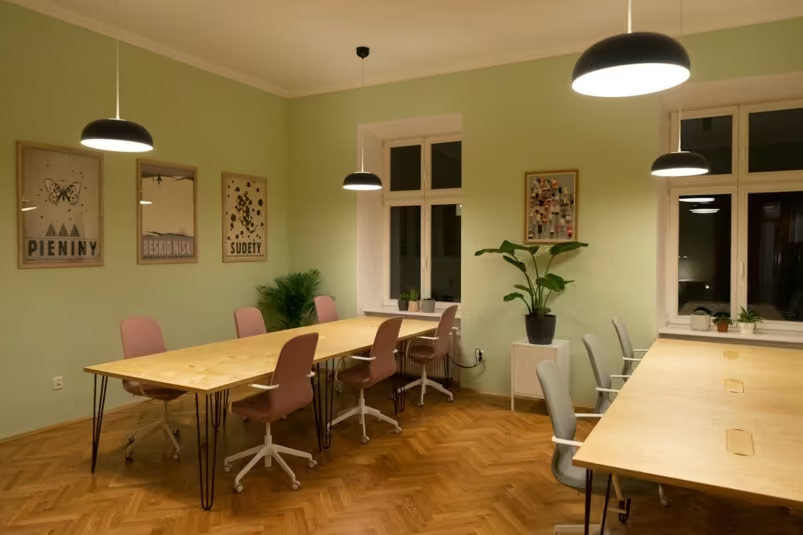
Colours like dusty pink or sage green are gaining popularity as they offer a soothing and comfortable feel to an office. They gently lift the mood of the space without being too overpowering.
How To Find the Right Colour Balance
Knowing the right colours to use in your office space is only half the challenge. The other half is learning how to use them effectively. Getting the balance right can be the difference between a well-designed space and an overstimulating one.
Use lighter colours to brighten the space
If your office space has no windows or lacks natural light, opt for warm whites, beige or pale pastel shades on the walls. These reflect any light and offer an open and airy feel.
Don’t use dark colours directly opposite windows
Avoid placing bold or dark colours opposite windows as strong sunlight can make them feel harsh and overwhelming. Go for muted tones opposite windows, which gently diffuse light.
Mix saturation with texture
Highly saturated colours can be well balanced with softer textures, such as wooden flooring, fabric panels, or greenery.
Only use darker shades in large, well-lit areas
If your office space has high ceilings or large windows, adding a richer colour to a smaller wall can create a cosier atmosphere. Excellent examples of these colours are olive green or navy blue.
Why Office Colour Choice Matters
• It affects focus and productivity - The right colour choices, as mentioned above, can boost productivity, concentration and focus. Sometimes it can even lower fatigue levels.
• It reinforces brand identity – The colour of your office is the first thing a visitor will notice. Using a similar colour palette to your logo and branding your workspace can provide a consistent feel throughout. This can offer a professional image, especially in client-facing areas.
• It influences mood and morale – A dark or harsh colour scheme can make a space feel tense or boring. On the other hand, a balanced colour palette can evoke a sense of calm.
• It can define how an office space is used – Different colours can be used to define collaboration areas, and quiet zones as a great visual cue.
How Types of Lighting Affect Colour
The type of lighting in an office space can drastically change how colours appear. When we accompany our clients on office viewings, we always suggest that they pay attention to how the lighting and colours in a space work together.
Where possible, we recommend a second viewing on a day with different weather conditions, allowing clients to assess the lighting.
Here is our breakdown of how the main types of lighting can affect colour perception:
Natural Light
Natural light is considered the ‘gold standard’ in a workspace as it enhances most colours, especially neutrals and pastels. It also adds warmth to an office and boosts morale.
LED Lighting
LED lighting is now standard in most modern offices, as it is energy-efficient and available in a range of tones.
• Cool LED lighting mimics daylight and can boost alertness.
• Warm LED lighting softens colours and is ideal for breakout spaces and lounges as it adds comfort.
Halogen & Incandescent Lighting
Halogen and incandescent lights emit a warm glow, which can make most colours feel more inviting. However, they are less common in offices nowadays because they are less energy efficient. They can sometimes be found in meeting rooms.
Renting a Coworking Space? - The Ideal Colour Schemes
Coworking spaces rarely offer any form of customisation, which means you’re choosing a pre-designed environment. So instead of deciding what colour to use, you’re evaluating what's already there.
Here are the colours we would suggest looking out for:
• Yellow or orange in breakout spaces or collaboration areas suggests that the space is targeted towards networking and creativity.
• Blues or greens in certain zones can promote concentration and focus.
When viewing coworking spaces, we recommend asking yourself:
• Does the colour scheme match the type of work you do?
• Does the space feel energising or overstimulating?
• Are there individual zones for concentration and collaboration?
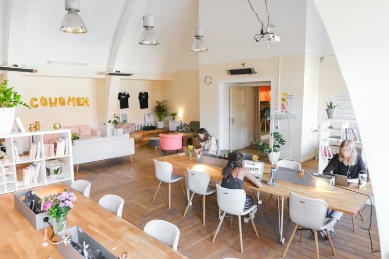
Colour Ideas for Meeting Rooms and Breakout Areas
• Meeting rooms – Best to decorate in blues or greys as overly bright colours can be a distraction during presentations or video conferences.
• Breakout areas – Soft, warm tones are ideal here, as they create an environment that is inviting and relaxing.
• Kitchenettes – These are the ideal spaces for unique decorations or artwork. Bright, uplifting tones offer a visual break from the main workspaces.
Colour Trends in Modern Serviced Offices
When renting a serviced office, especially in a place like London, the look and feel of a space often reflect its quality. While it can be tempting to opt for an aesthetically pleasing office, it is essential to choose options that offer both style and functionality.
These are the trends we’ve noticed when viewing serviced offices:
A move towards earthy, natural tones
Many serviced offices are using colour palettes that mimic nature, including soft greens and light browns. These align with the growing focus on sustainability and biophilic office designs. These tones are ideal for creating an office space that feels more human and less generic.
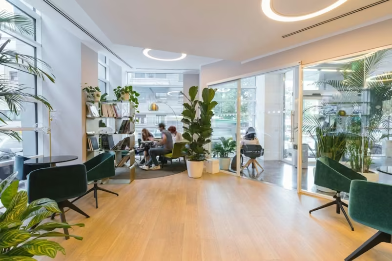
More layering and texture
Instead of bare white walls, many office spaces are layering and mixing textures and patterns to create visual interest whilst steering away from bright and distracting colours.
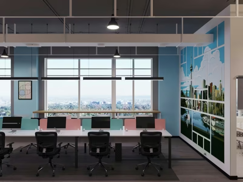
Purposeful pops of colour
Intentional bursts of bold colours, often in artwork or furniture, allow a serviced office space to feel unique whilst catering to diverse organisations.
Choosing a productive office space is more than just the facilities that are included. Colour can influence mood and morale, and it certainly should not be overlooked.
In our experience, taking the extra time to evaluate an office’s colour scheme during a viewing is worth the time to ensure a focused and productive team.


